UEA
ENV
CRU
Homepage
Data
CRU links
CRU staff
CRU data
External links
InterpretingCC
Homepage
NAO
A visualisation of the current year's global and hemispheric temperature anomalies, in comparison with the three warmest years on record.
The temperature dataset is our HadCRUT5 data.
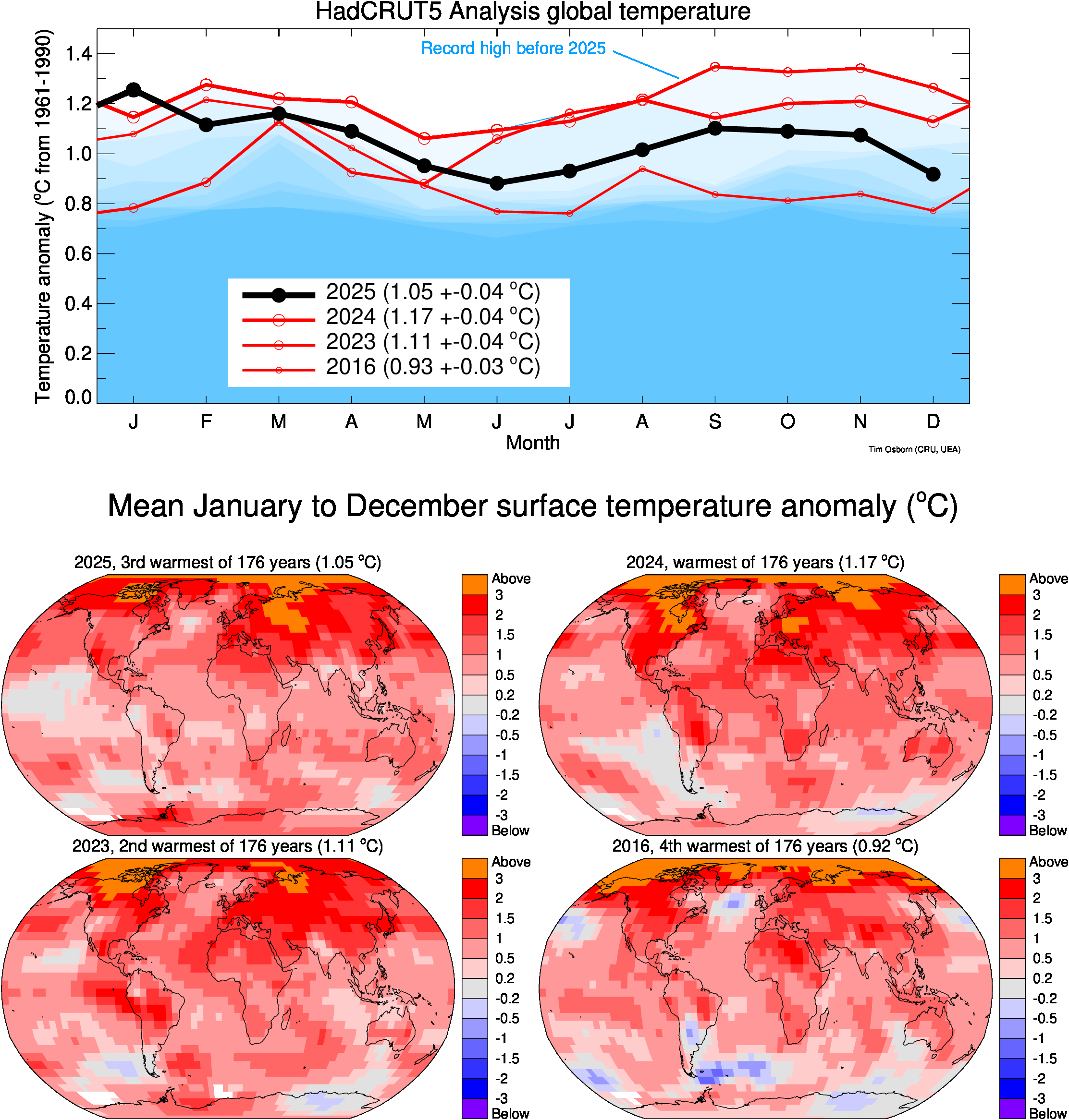
Global temperatures
The top panel shows global-mean temperature anomalies for the current year so far (black). The red lines show the monthly temperature anomalies for the 3 warmest years in our record (see key). The blue line near the top shows the record high for each individual month prior to the current year. The blue shading marks the next nine warmest values for each individual month, so that the darkest blue is the 10th warmest (prior to the current year) for each month. From this you can see which months of the current year lie in or outside the warmest 10 values for that month.
One thing to remember is that each of these values is uncertain. For annual-mean temperatures since 1950, the uncertainty is about +/-0.05 °C (see Fig. 1a of Morice et al., 2021). Therefore the warmest 3 years are based on the best estimate temperatures, but if the differences between these years are less than the size of the uncertainties then the true ranking order may be different.
The maps below show the January-to-XXX (where XXX is the latest month for which we have processed HadCRUT5 data in the current year) averages for the current year and its current rank when compared with the January-to-XXX averages of all other years in the HadCRUT5 data. The other three maps also show the January-to-XXX averages for the three years that ended up (when data for the whole year became available) being the warmest three years, together with their ranks based only on data for months January-to-XXX.
Click for larger image
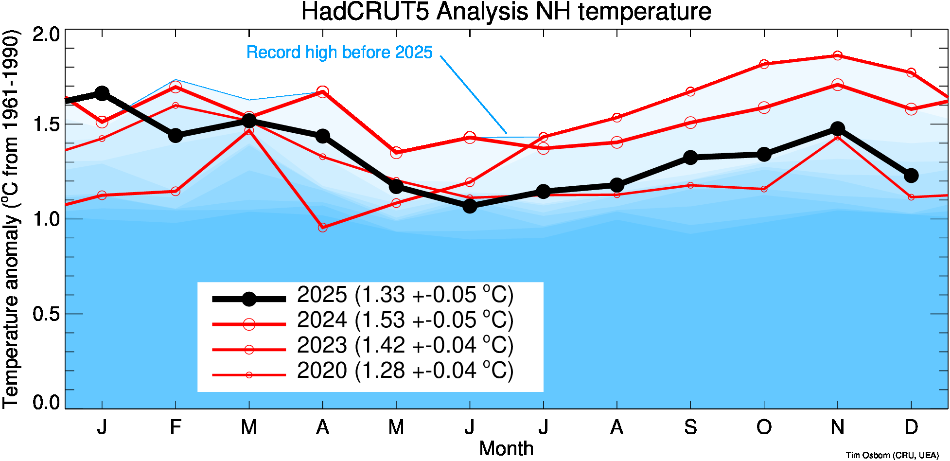
Northern Hemisphere temperatures
As above, but for the Northern Hemisphere (NH) temperature anomaly for the current year compared with the 3 warmest years in the NH.
Click for larger image
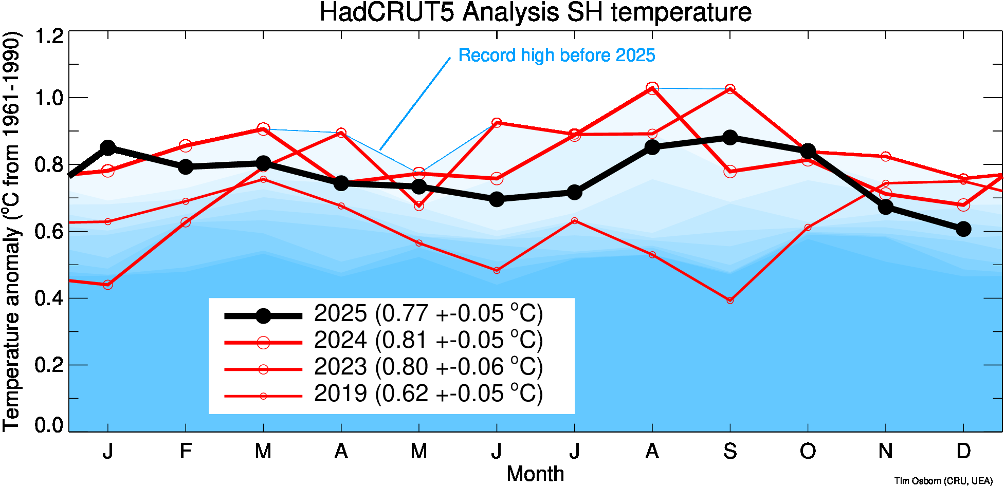
Southern Hemisphere temperatures
As above, but for the Southern Hemisphere (SH) temperature anomaly for the current year compared with the 3 warmest years in the SH.
Click for larger image
References
- Morice, C.P., Kennedy, J.J., Rayner, N.A., Winn, J.P., Hogan, E., Killick, R.E., Dunn, R.J.H., Osborn, T.J., Jones, P.D., and Simpson, I.R., 2021: An updated assessment of near-surface temperature change from 1850: the HadCRUT5 dataset. Journal of Geophysical Research 126, e2019JD032361, doi:10.1029/2019JD032361